Impact
From 3–4 Week Dev Cycles to a Single Source of Truth
Before the design system, engineers rebuilt components for every feature. Designers in the US and Ireland worked from different assumptions. The system fixed both.
Problem
Design Inconsistency at Enterprise Scale
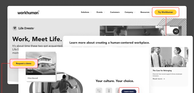
Workhuman builds HR and recognition products used by global companies. By the time I joined, the design inconsistency had become a real problem — two regional teams, no shared components, and engineers rebuilding the same things over and over.
US + Ireland Working in Silos
Two teams with different design approaches, no shared language, and no single source of truth.
- Misaligned implementations across regions
- Duplicate work happening in parallel
- Knowledge gaps across time zones
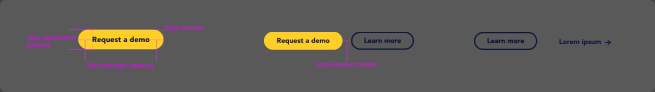
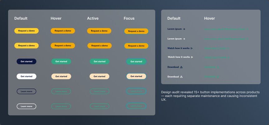
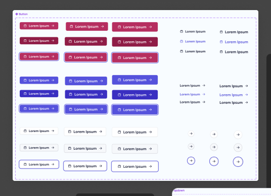
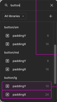
15+ Button Variations
Each designer creating their own styles, colors, and spacing scales — by hand, per feature.
- Inconsistent UX across products
- 15+ button variations in production
- Massive technical debt accumulating
3–4 Weeks Per Feature
Engineers rebuilding components from scratch because no reusable code library existed.
- 3–4 week dev cycles per feature
- 85% of designer time spent answering repeated questions
- No reusable component code library
Token Architecture
Foundation of Scalability
The token system took a few weeks to set up properly. It's slower upfront than just picking colors and moving on — but it's what made everything downstream actually manageable.
- Dark Mode = Change Tier 1 primitives only
- All components update automatically
- Dark Mode shipped in 2 weeks (not 3 months)
- Single source of truth for 20+ people
- US & Ireland teams stay synchronized
- No "shadow design systems" emerging
- Update one token = update everywhere
- No hunting for hardcoded values
- 70% reduction in design debt
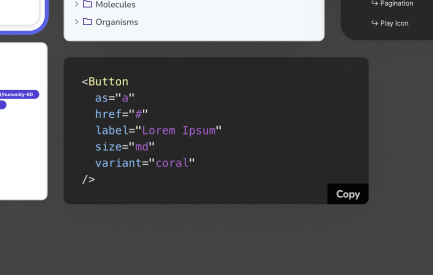
Component Library
Building Blocks of Consistency
Foundation, navigation, data display, forms, feedback — every category documented with states, variants, and accessibility annotations.
Typography scale (6 sizes), color palette (primitive + semantic), 8pt grid spacing, elevation system, border radius scale, 200+ icon library.
Top nav, sidebar, breadcrumbs, tabs, pagination, steppers. Cards (8 variants), sortable tables, lists, avatars, tooltips, modals.
Text inputs (8 states), dropdowns (6 states), checkboxes, radios, toggles, date pickers. Alerts, toasts, progress bars, loading spinners, status badges.
Documentation
Making the System Usable
Components without documentation = components that don't get used. Every component shipped with overview, anatomy, code examples, usage guidelines, behavior specs, and accessibility notes.
Governance & Adoption
A System That Gets Used
The library being built wasn't the hard part. Getting people to actually use it — and keep using it as the product grew — that took more deliberate work.
Cross-Functional Ownership
Designers, developers, and product managers all had defined roles in the governance model. Contributions and reviews were distributed, ensuring the system reflected real product needs.
Contribution Process
New component request → validate need (3+ use cases) → design review → engineering feasibility → documentation required → approval and addition to library. Kept the system lean.
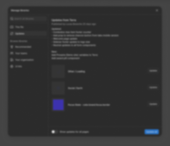
Version Control
Semantic versioning (1.2.3), changelog with every release, deprecation warnings with 6-month notice, and migration guides for breaking changes. Teams could update on their schedule.
The first few components didn't feel any faster than just doing it from scratch. The payoff came gradually — around component 15 or 20, engineers stopped pinging designers for specs on things we'd already solved. New features started showing up in reviews that were already mostly right. That's when I understood what the system was actually for.
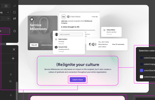
Solution in Context
Design System in Production
Token-based theming in action across Workhuman's products — consistent component usage, accessibility built in, responsive from 320px to 1920px.
- Create dark color primitives: 1 day
- Update semantic token mappings: 2 days
- Test components for contrast issues: 1 week
- Ship: 1 day
Old approach (component-by-component updates): 2–3 months. New approach: 2 weeks total.
- Components adapt 320px → 1920px
- All touch targets meet 40x40px minimum
- Grid system handles complex responsive layouts without custom CSS