Impact
Nearly 2 in 3 candidates now explore job listings
Measured post-launch via HEAP Analytics. The funnel that was losing 97% of visitors now converts the majority of them.
Problem
The Business Challenge
Workhuman's careers experience was a thin layer over Workday (ATS). Candidates landed, clicked a job, and immediately left for Workday — giving Marketing zero tracking data.
2.7% CVR = Massive Leakage
Only 3 out of 100 candidates viewing the careers homepage clicked through to browse job listings.
- No culture context provided
- Competing on job titles alone
- Lost storytelling opportunity
- Marketing couldn't track journeys
33.8% Bounce Rate
Candidates weren't finding value in the content and left immediately.
- Insufficient candidate context
- Lower-quality applications
- Poor cultural fit matches
- More recruiter time screening
No Attribution Data
Marketing couldn't prove ROI on recruiting campaigns.
- Can't attribute applications to campaigns
- Can't measure content effectiveness
- Can't justify recruiting budget
The analytics told a pretty clear story: average session was 2 minutes, candidates viewed 1 job, and 85% clicked Apply and immediately left for Workday. They were using the site like a job board, not an employer brand experience. All the culture content that existed — team pages, benefits, values, awards — was completely invisible to someone who landed and just wanted to see what was open.
Research & Discovery
Understanding the Opportunity
Four research activities — and the one that surprised me most was the content audit.
10+ Leading Tech Companies
Evaluated Canva, Salesforce, Figma, Lattice, Notion, Shopify, Stripe, Intercom, HubSpot, Atlassian across 3 dimensions: careers overview pages, job search/browse experiences, and job detail pages.
Key patterns identified:
- Rich media for culture storytelling
- Clear navigation to sub-categories
- Filtering by location/department as baseline
- Best experiences keep candidates on-site longer
7 Stakeholders Across Functions
Marketing (3): Need attribution data. Recruiting (2): Want qualified candidates. HR (2): Benefits/culture accuracy.
Key insights:
- "We have no idea what content drives applications."
- "Candidates ask the same questions in the first interview."
- "Benefits differ by region — we need flexibility."
Existing Traffic Data
- Avg time-on-site: 2 minutes
- Bounce rate: 32.9%
- Jobs viewed per session: 1.0
- Apply click-rate: 85% (then immediate exit)
Translation: Candidates treat us like a job board, not an employer brand experience.
Hidden Assets Identified
- 10 distinct teams with unique cultures
- 4 regional benefit structures
- 2 office locations
- 5 cultural programs
- Company values and awards
All this content existed but wasn't accessible to candidates during job search.
Synthesis
What I actually came away with
The homepage wasn't doing its job
A 2.7% CVR means candidates landed and left immediately — they had no reason to stay. The site was asking people to browse jobs before giving them any reason to want to work there. The homepage needed to answer "why Workhuman?" before it asked anyone to look at listings.
Candidates need different things at different moments
Someone who just heard of Workhuman has different questions than someone evaluating a specific role. Trying to serve both on the same page was part of why the original site failed. Three layers ended up feeling right: one to build interest, one to browse, one to evaluate.
Tabs work because candidates care about different things
The competitive audit showed Canva and Figma both using tabs on job detail pages. It clicked — candidates don't read a job posting top to bottom. Some care about the team, some about benefits, some about where they'd be working. Tabs let them go straight to what matters to them.
People find better jobs by wandering
The analytics showed candidates only viewed 1 job per session on average. But from the stakeholder interviews, recruiting knew that their best hires often came in for one role and ended up in a different one. The site wasn't giving people a way to wander — so they didn't.
Solution
Three-Layer Progressive Engagement System
Three pages, each with a specific job to do.
Goal: Drive CVR from 2.7% to 40%+. Build interest before job browse.
Smart filters by location, department, and role type. Stay on Workhuman.com.
Right Rail: "Recommended Jobs" (persistent across all tabs)
Full context before the Apply click.
Design
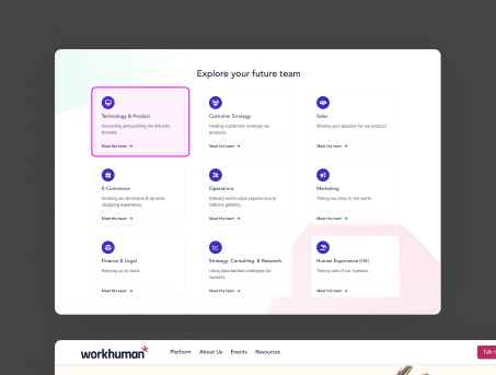
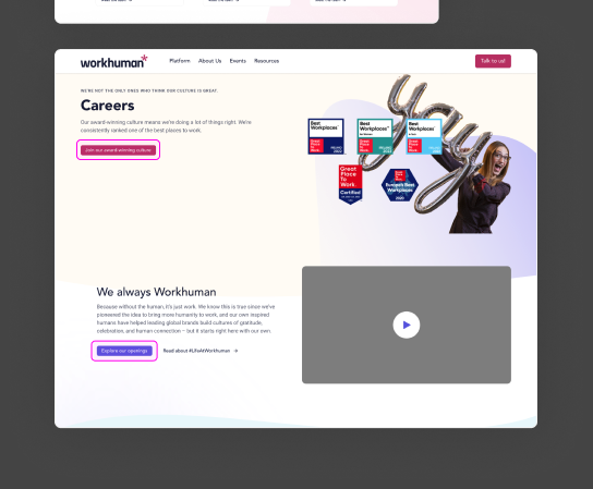
Layer 1 — Careers Homepage
Culture storytelling before the job browse. Before: a generic team grid with no narrative. After: compelling headline, employee video, and a clear path to explore roles.
Layer 2 — Browse & Filter
Color-coded departments, optional filters, and persistent breadcrumb navigation. Designed for both explorers ("just looking") and targeted searchers ("I want Product roles in Dublin").
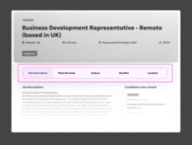
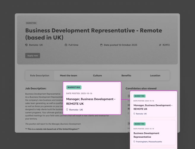
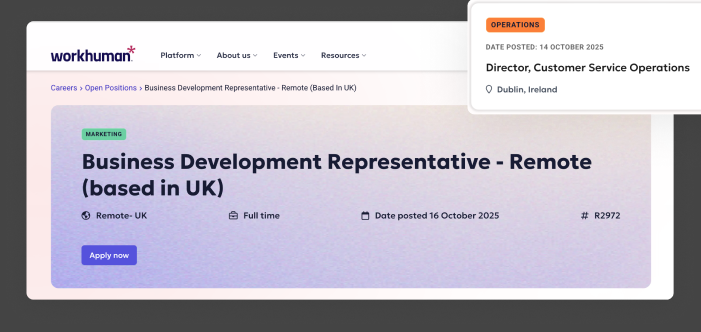
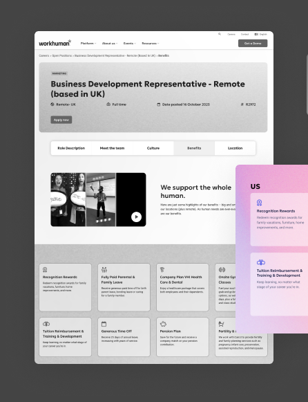
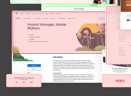
Layer 3 — Job Detail + Recommendations
The 5-tab system gives candidates exactly the information they need — when they need it. The right rail keeps additional roles visible without interrupting the current read.
The 13.1% bounce rate on the job browse page was the number I was most glad to see. Low bounce there meant candidates were actually engaged — not just landing and leaving. The homepage wasn't pushing unqualified people into the funnel. It was giving interested people a reason to go deeper.
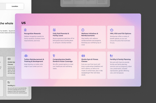
Benefits Tab — Localized at Scale
4 regional variants (US, Canada, Ireland, UK) built from one flexible component system. Adding a new region requires updating content only — no design or engineering work.
Design System Contributions
Reusable Patterns
Every component built for this project was designed to be reused. Several have since been adopted across other parts of the site.
Used across 3 product areas
Job details, team pages, office location pages. Horizontal on desktop, dropdown on mobile. Now part of the main design system.
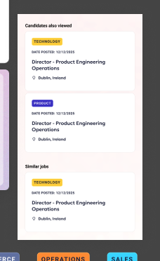
"Candidates Also Viewed"
3-item persistent rail, same-department logic, opens in new tab to preserve context. Pattern adopted site-wide after launch.
10 teams, color-coded
Used across job cards, team pages, and navigation. Instant visual scanning reduces cognitive load during browsing.
Impact & Outcomes
Measuring Success — Real Data
HEAP Analytics data, October–December 2025. Not a spike — November outperformed October.
- Context to self-select before applying — cultural fit, team, benefits, location all visible before the Apply click
- Browsing multiple roles increased naturally via Recommended Jobs rail
- 13.1% bounce on job browse = candidates are engaged, not lost
- Better-informed applicants arriving with realistic expectations
- Candidates self-selecting on culture before the first screen call
- Regional content (US/Canada/Ireland/UK benefits) accurate per location
- Full candidate journey now trackable for the first time
- Campaign attribution now measurable (previously zero visibility)
- Tab system allows A/B testing individual content sections
Reflection
What worked, what I'd do differently
- Three-layer architecture mapped cleanly to the candidate journey — each layer had one job
- The "Candidates Also Viewed" rail drove 3–4x more jobs explored per session and got adopted site-wide
- Cross-functional buy-in held because every stakeholder got something: Marketing got attribution, Recruiting got quality, Engineering got a clean integration pattern
- Involve the content team earlier — content creation was the longest part of delivery, and I could have unblocked it faster
- Test the tab order rather than assuming Role Description should be first — that was an assumption I'd want data on
- Mobile tab navigation was less discoverable than desktop; I'd invest more in the mobile-specific pattern