.png)
Step 1:
Gathers the minimum viable context: organization size and industry.
Same instinct, five layers.
Workhuman is a B2B SaaS platform for employee recognition. Over four years I worked across conversion design, product systems, production infrastructure, creative technology, and interactive tooling — different problems at different scales, but the same underlying move: identify the problem, build the solution.
Scope
Conversion design, two design systems, interactive sales tooling
Context
B2B SaaS, in-house, US + Ireland design org
Delivery
Careers experience, Aura DS, Echo DS, Ceros ABM, ROI calculator
Status
Four years, shipped and measured
Conversion Design
97 of 100 visitors never explored a single job.
Output
2.7% → 64.6% homepage-to-jobs conversion
Delivery
↓59% exit rate on the new experience
Portfolio
1 → 3–4 jobs viewed per session
Measured in Heap Analytics; Oct–Dec, 3 months post-launch
The Careers page was losing nearly everyone. 97 percent of homepage visitors never clicked through to browse a single job listing. When we dug into Heap, the reason was structural: the page led with an award badge and a company description — the kind of content that answers "Is this a good company?" before a candidate had any reason to ask. The jobs were buried.
Only 3 out of 100
candidates viewing the careers homepage clicked through to browse job listings.
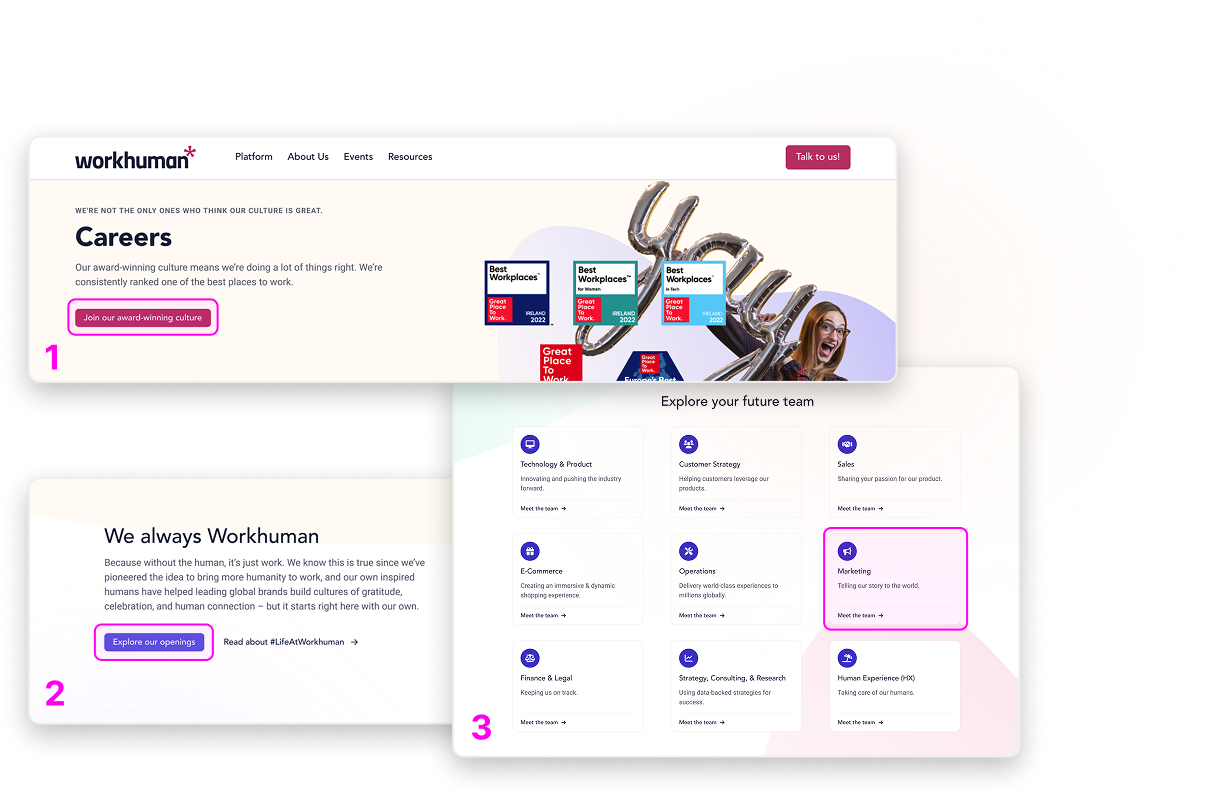
The redesign worked from the drop-off data outward:
The structural answer was sequencing: lead with what Workhuman actually is as a place to work — the teams, the culture, the values — before asking anyone to browse jobs. Then make browsing effortless. Then, once someone finds a role, pull them toward a second one. Conversion compounded: 55.3% the first month, 73.7% the second, 77.6% the third.
Layer 1: The "why" before the "what."
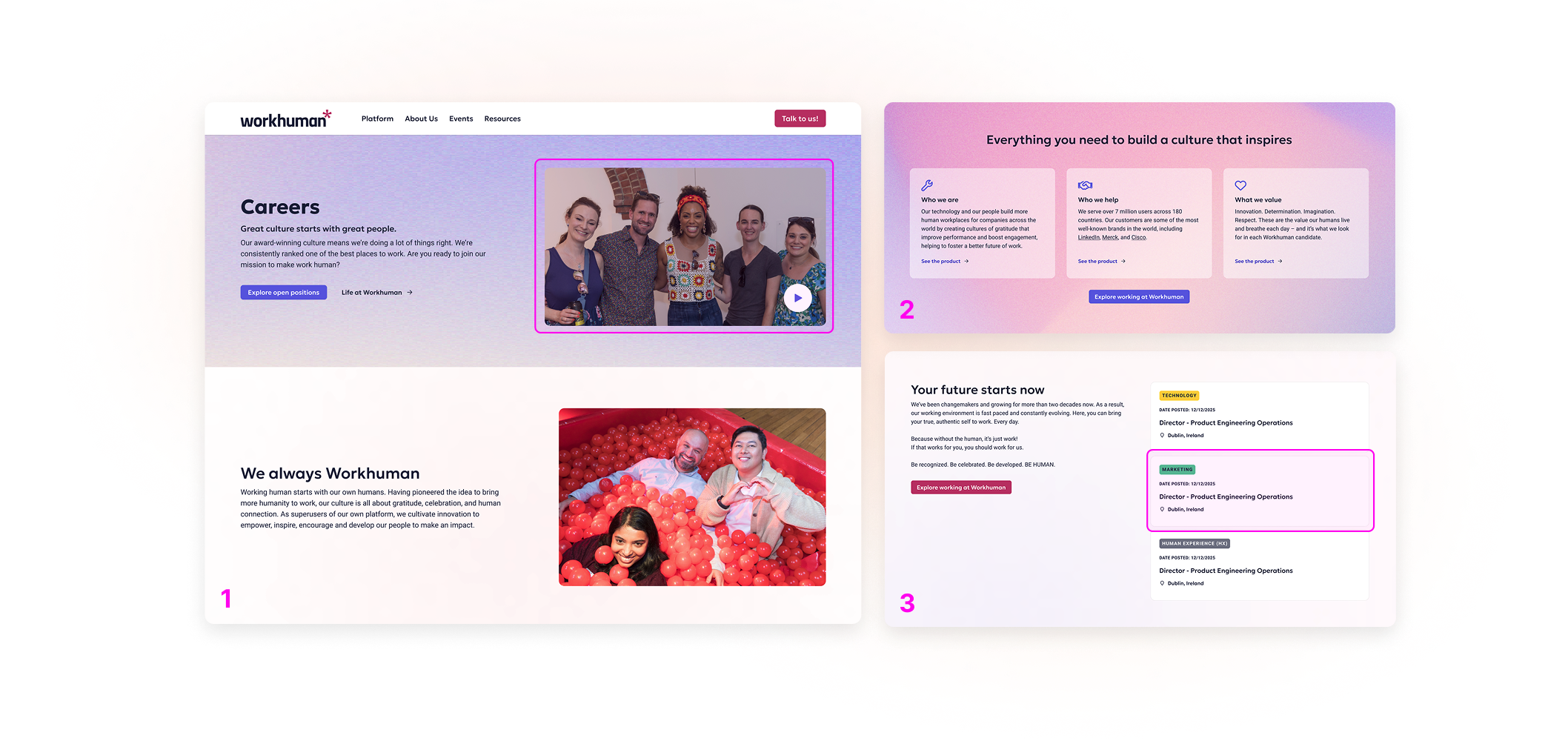
Culture-first homepage: testimonial video up top, values in action, regional benefits, ten teams.
Layer 2: Browse without friction.
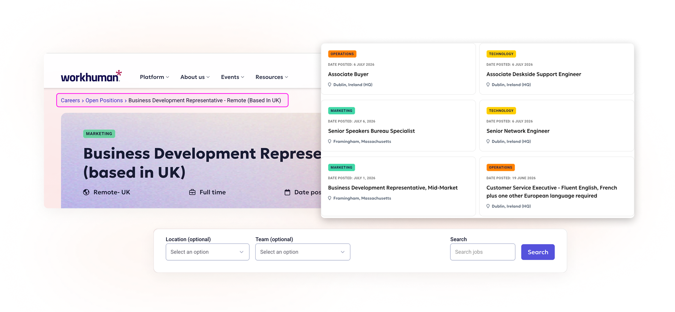
Filters stay optional while the tags do the scanning. Ex.: Product roles are pink everywhere they appear.

Color-coded department tags for instant scanning; filters kept optional so casual browsers and targeted searchers both find their footing. 13.1% bounce on the browse page.
Layer 3: The next job, before they ask.
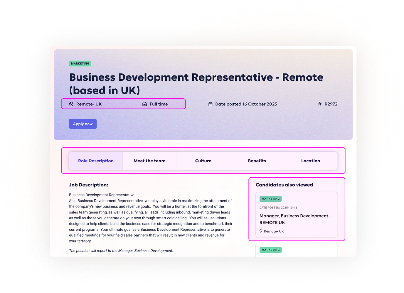
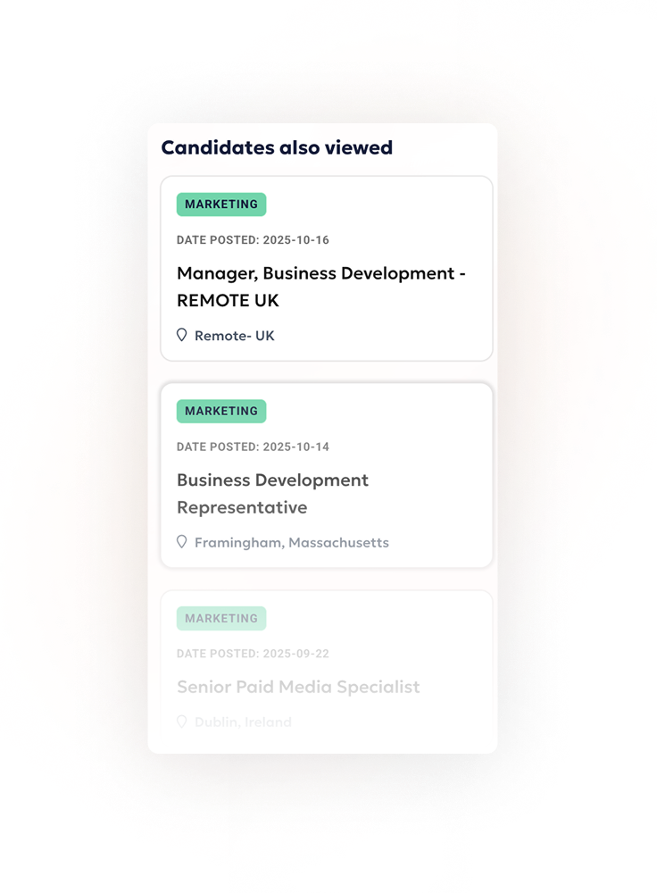
Five tabs, five candidate questions: role, team, culture, benefits, location.
Three recommendations, persistent across every tab. This is where 1 job per session became 4.
The system underneath: three layers, each answering one question. Why Workhuman → what roles exist → is this role for me. The right-rail recommendations on Layer 3 took jobs viewed per session from 1 to nearly 4.
Product Systems
Fifteen button variants. Two offices. No shared language.
Output
15+ → 1 button variants consolidated
Delivery
~60% dev cycle reduction
Portfolio
2 offices one token system
Workhuman's US and Ireland design teams had developed their component libraries independently. By the time I joined, the drift was visible everywhere — inconsistent spacing, divergent type scales, and a button component that had forked into fifteen variants across both codebases, none of them formally documented.
The work was less about building new components and more about establishing the conditions under which both teams could stop rebuilding the same things. That meant a token layer first: named decisions about color, spacing, and typography that could travel between Figma and code without re-interpretation at each handoff.
Tier 1:
Primitives
Ex.: humanity-60, spacing-4, font-16
Tier 2:
Aliases
Ex.: brand-primary = humanity-60
Tier 3:
Semantic Tokens
Ex.: surface-primary, text-default
Tier 4:
Component Tokens
Ex.: button-bg-primary, input-border-focus
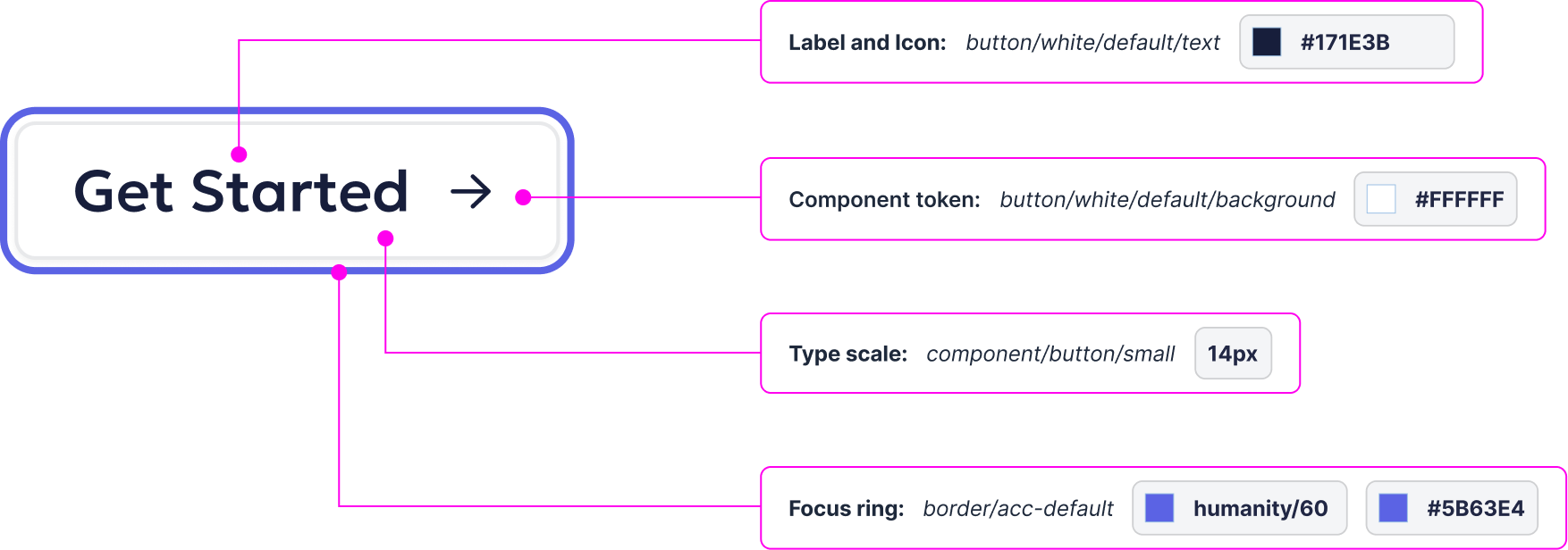
White variant, focus state. The ring resolves to humanity-60 — the same primitive in Tier 1 above. That's the cascade, on one component.
"We spend 60% of our time answering the same design questions."
(Engineering, discovery interviews)
2 wks → 3 days
new designer onboarding
↓60%
engineer questions after docs
95%
implementation adherence
Contribution pipeline: How new components are added to Aura
Semantic versioning, changelog every release, 6-month deprecation notice, migration guides for breaking changes
Request
Validate need
3+ use cases
Design
review
Engineering
feasibility
Docs
required
Ship
Compromise: Token naming took three iterations before the semantics made sense to engineers; this causes early confusion but establishes long-term clarity.
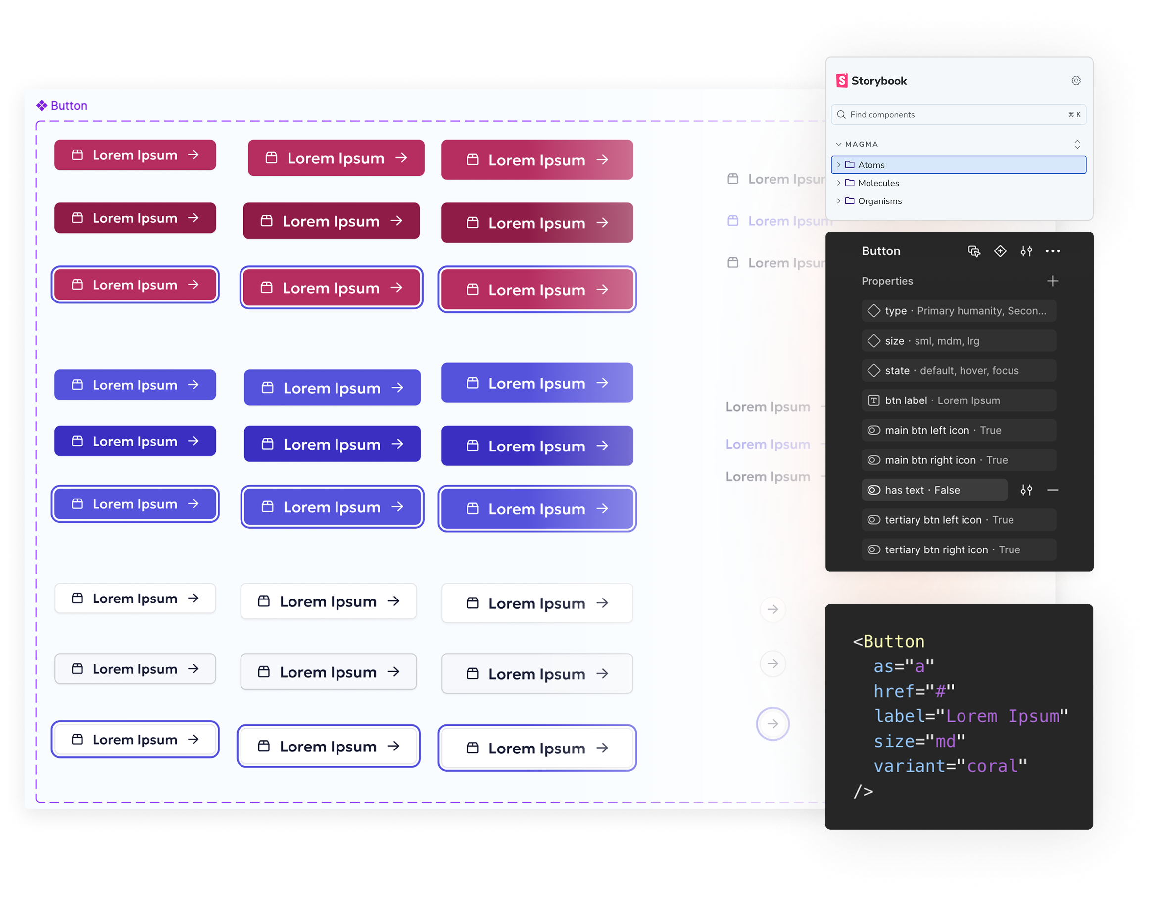
150+ components · 200+ icons · 8pt grid · 6-size type scale · WCAG AA baked in
Production Infrastructure
Thirty deliverables a month. Starting each campaign from scratch became the bottleneck.
Output
30x deliverables per month, systematized
Delivery
6 channels one component library
Portfolio
NA + EMEA multi-vertical rollout
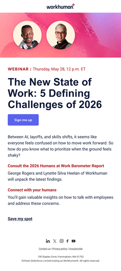
Workhuman's marketing team ran a monthly webinar program across six channels: Social, email, display ads, organic social, landing pages, and on-brand event promotion. Every month, the same visual problem needed to be solved again. There was no system for it. Echo DS was the system — a purpose-built component library structured as two parallel tracks: a Webinar Library (ads, landing pages, and email) and an Organic Social Library (award badges).
One campaign, four surfaces
Landing page
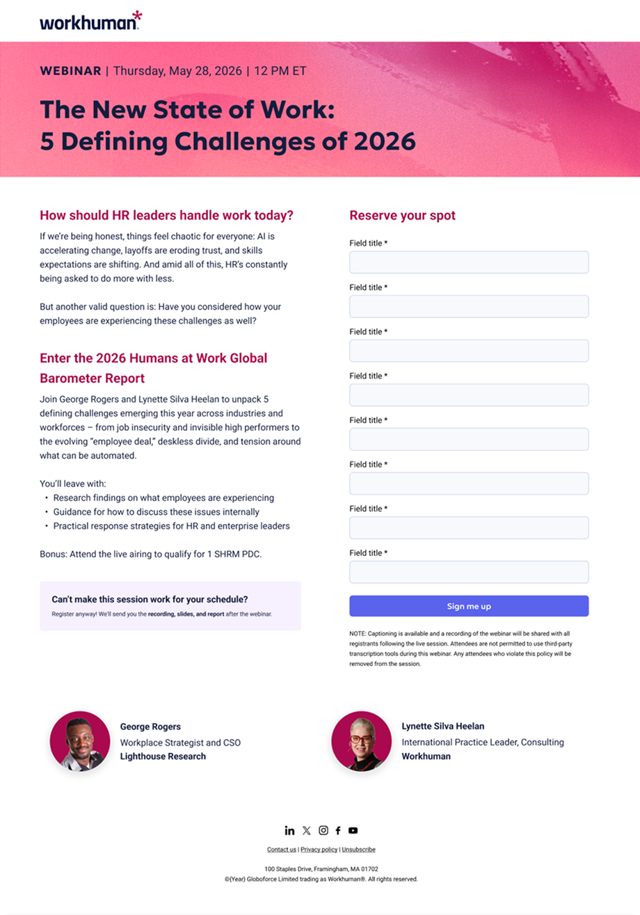
Display ads
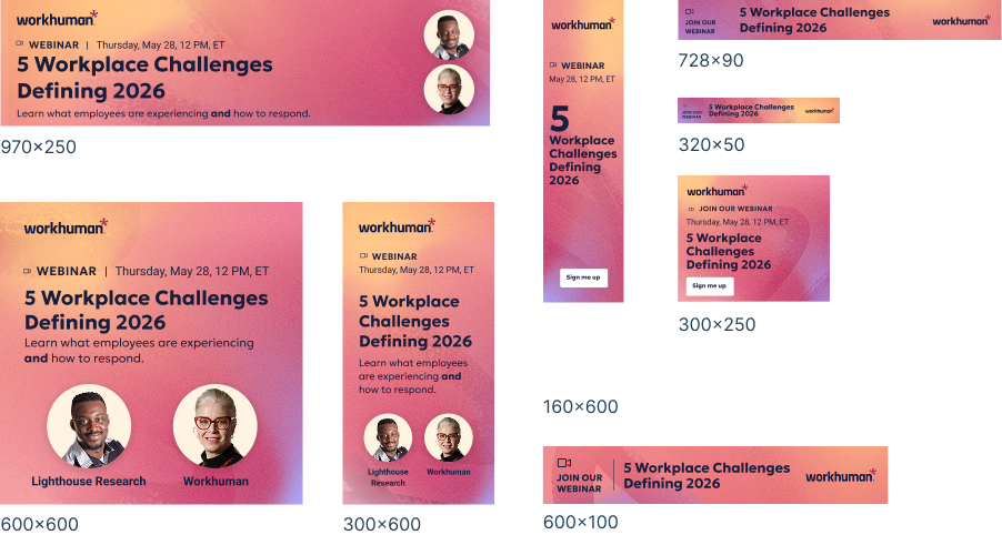
Social post
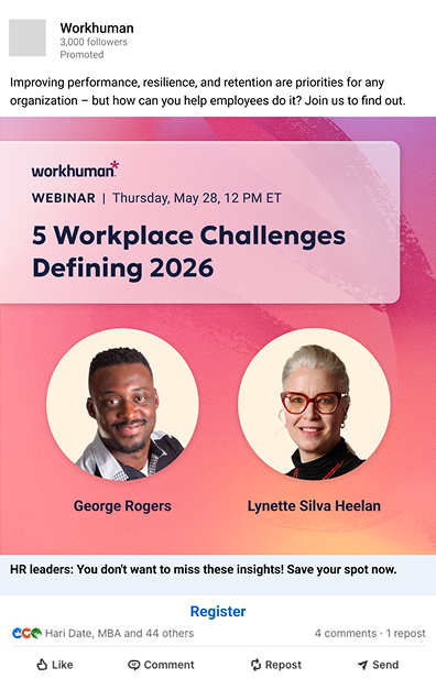
Campaigns should be a configuration problem, not a production problem. May 2026: one webinar, every surface, configured from Echo DS.
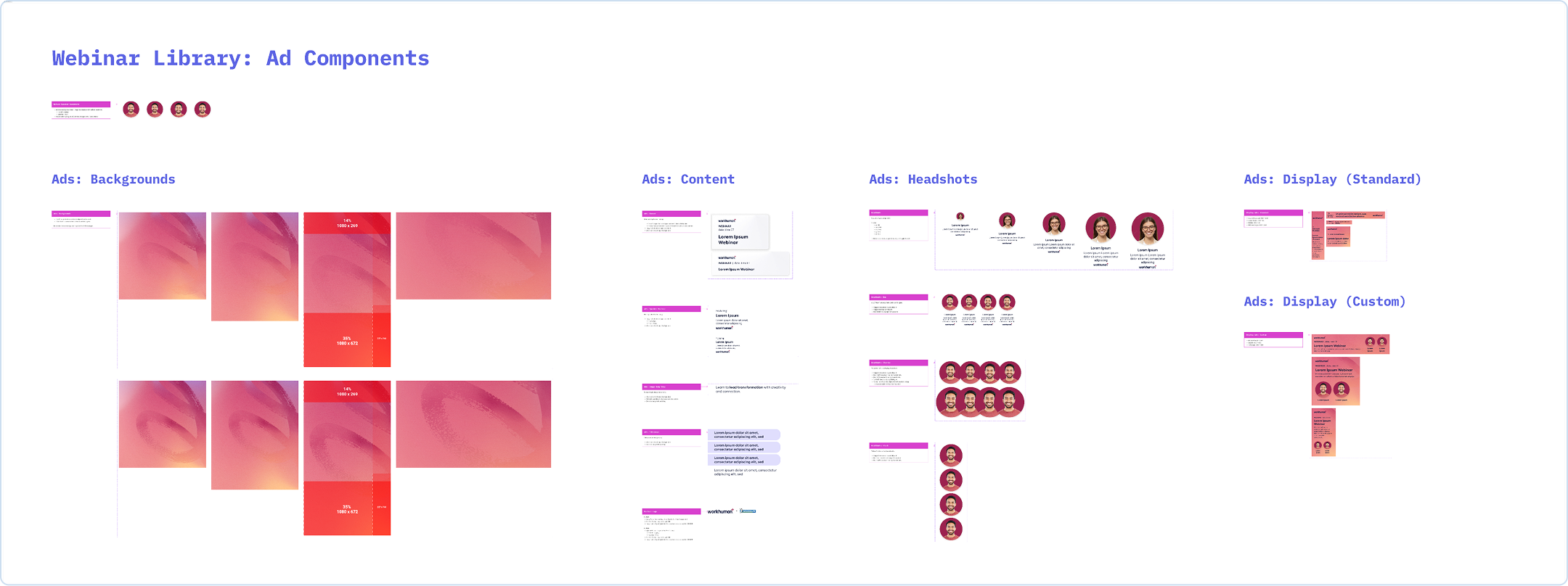
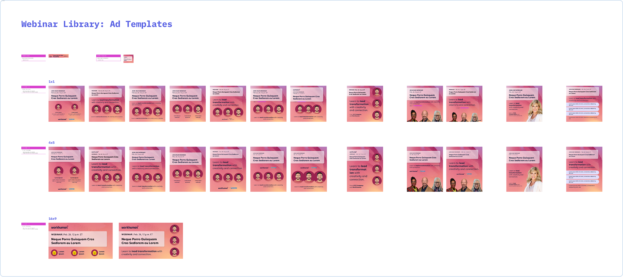
Landing page template
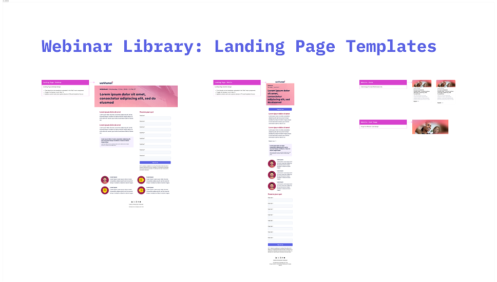
Accessibility and compliance copy ship inside the components, not on a checklist.
Email template
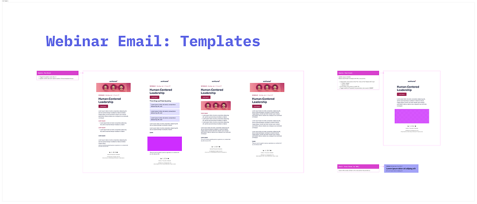
Even the follow-up is componentized: Attended and No-show variants from one template.
Once the component layer existed, each month's deliverables became an assembly question rather than a design question.
Creative Technology
Every vertical deserves its own look, but the structure underneath never changes.
The same instinct was running in the other direction, outward into the sales motion. Workhuman's Ceros-based ABM program powered microsites across North America and EMEA markets.
Each vertical needed its own look, but the underlying structure was the same: hero, value prop, case study, CTA. Ceros RFP+ gave the team a modular block library configured per vertical rather than rebuilt per program — and the blocks were shaped in wireframes with dev before anything reached high fidelity.
The system's whole life in three frames: from dev's sticky notes to a shippable vertical.
Wireframe + dev sticky
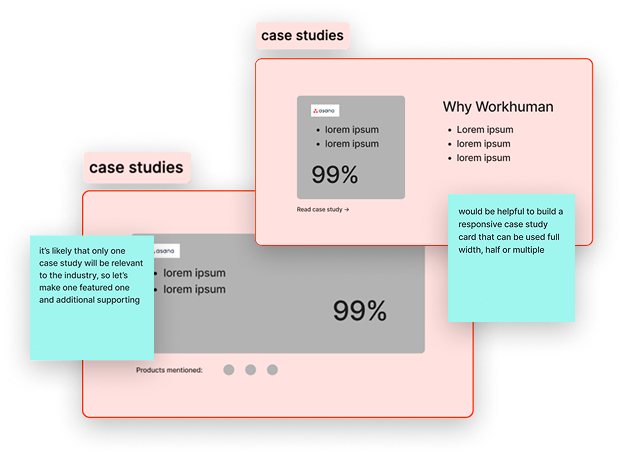
Blocks negotiated in wireframes with dev before building.
Block library
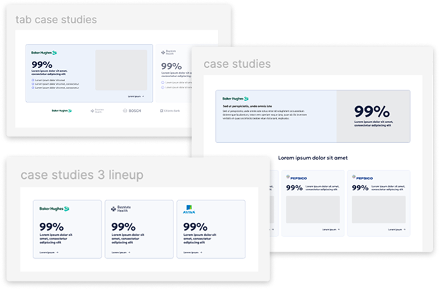
Every block componentized; case study options in three flavors.
Vertical instance
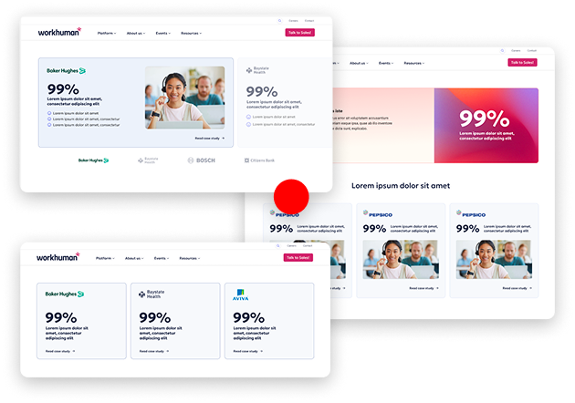
One vertical configured, wireframe to HiFi.
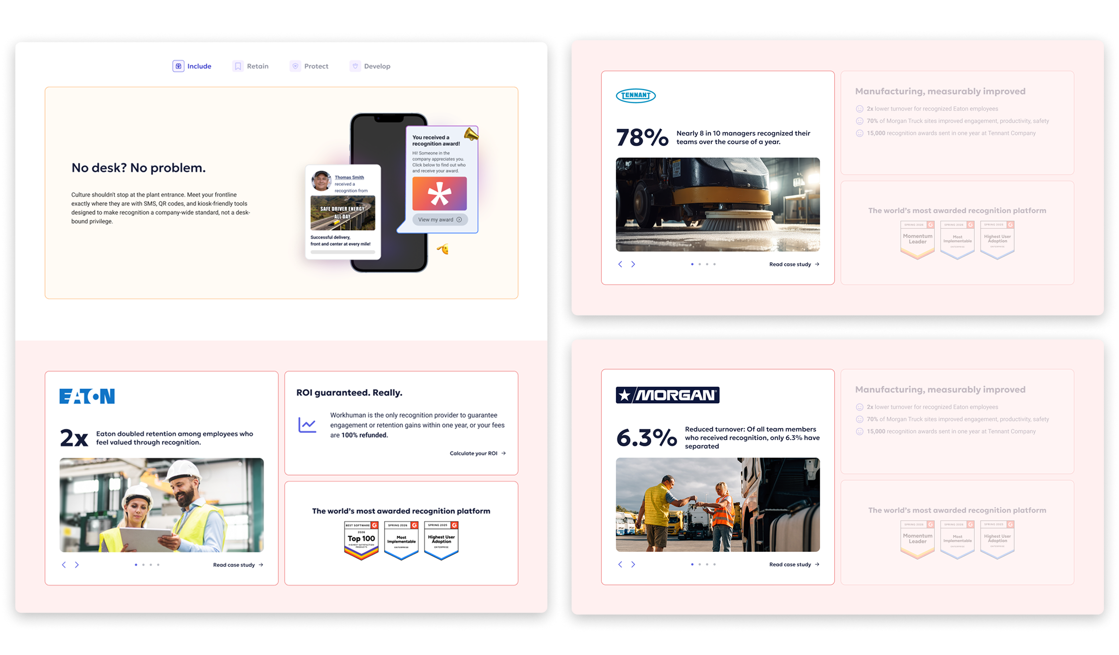
Interactive Tooling
The calculator had to earn the trust of prospects in three steps.
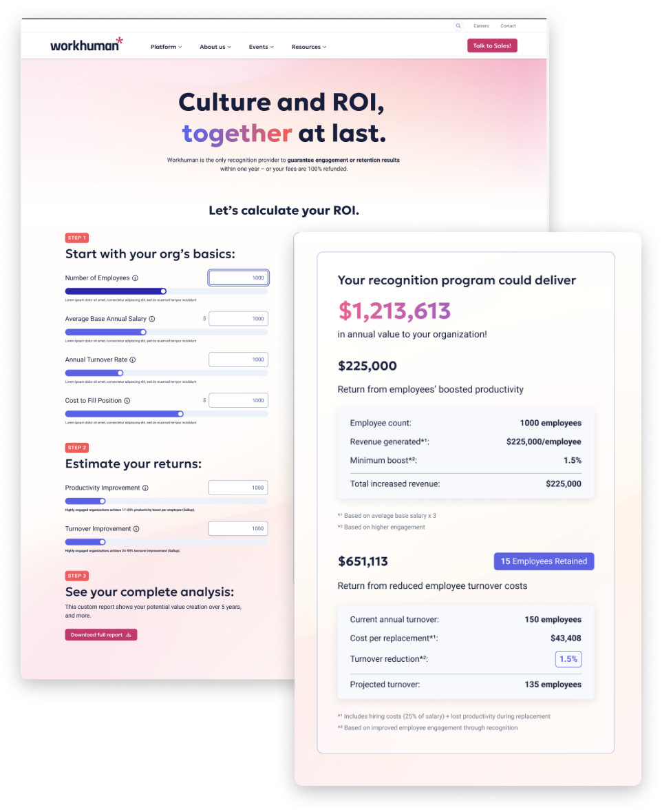
Workhuman needed a sales tool — something a rep could walk a prospect through that would produce a credible ROI estimate specific enough to feel real, not generic. The design problem wasn’t the data model, it was pacing. The solution was a three-step progressive disclosure flow:
Step 1:
Gathers the minimum viable context: organization size and industry.
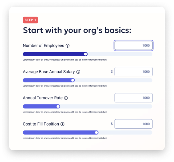
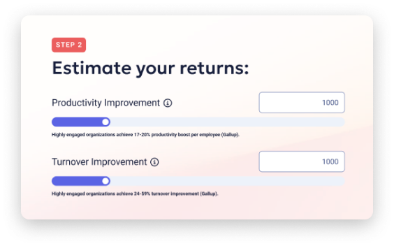
Step 2:
Surfaces a returns estimate calibrated to those inputs.
Step 3:
Unlocks the full analysis, including a competitive comparison showing how Workhuman’s returns benchmark against peer platforms.
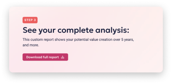
Logic: Earn trust at each step before asking for more. A prospect who completes step one has already opted in. By step three, the output has enough specificity that it reads as analysis, not marketing.
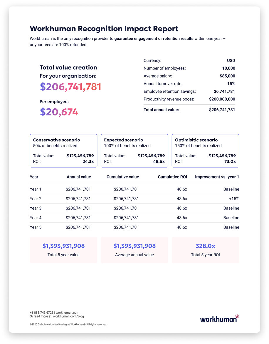
The leave-behind:
Workhuman Recognition Impact Report
Step three’s unlock isn’t a screen. The calculator generates a report designed at print dimensions: branded, paginated, and populated with the prospect’s own numbers. The rep leaves something behind.